Property management dashboard
Design Enhancement for Property Managemnet platform

The goal was to streamline Smoobu’s Dashboard design and enhance the user experience for property owners/managers, focusing on booking flows, communicating improvements and the ability of merging different booking platform data into one dashboard.
Timeline
From explorations to final designs took 6 month together with A/B testing
Background
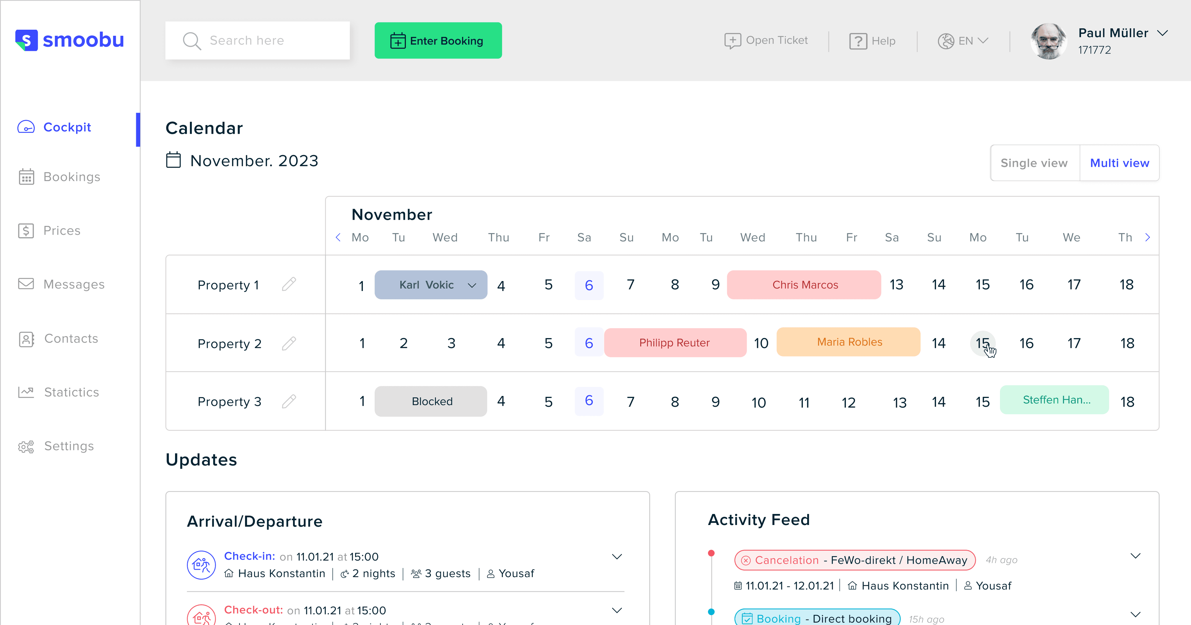
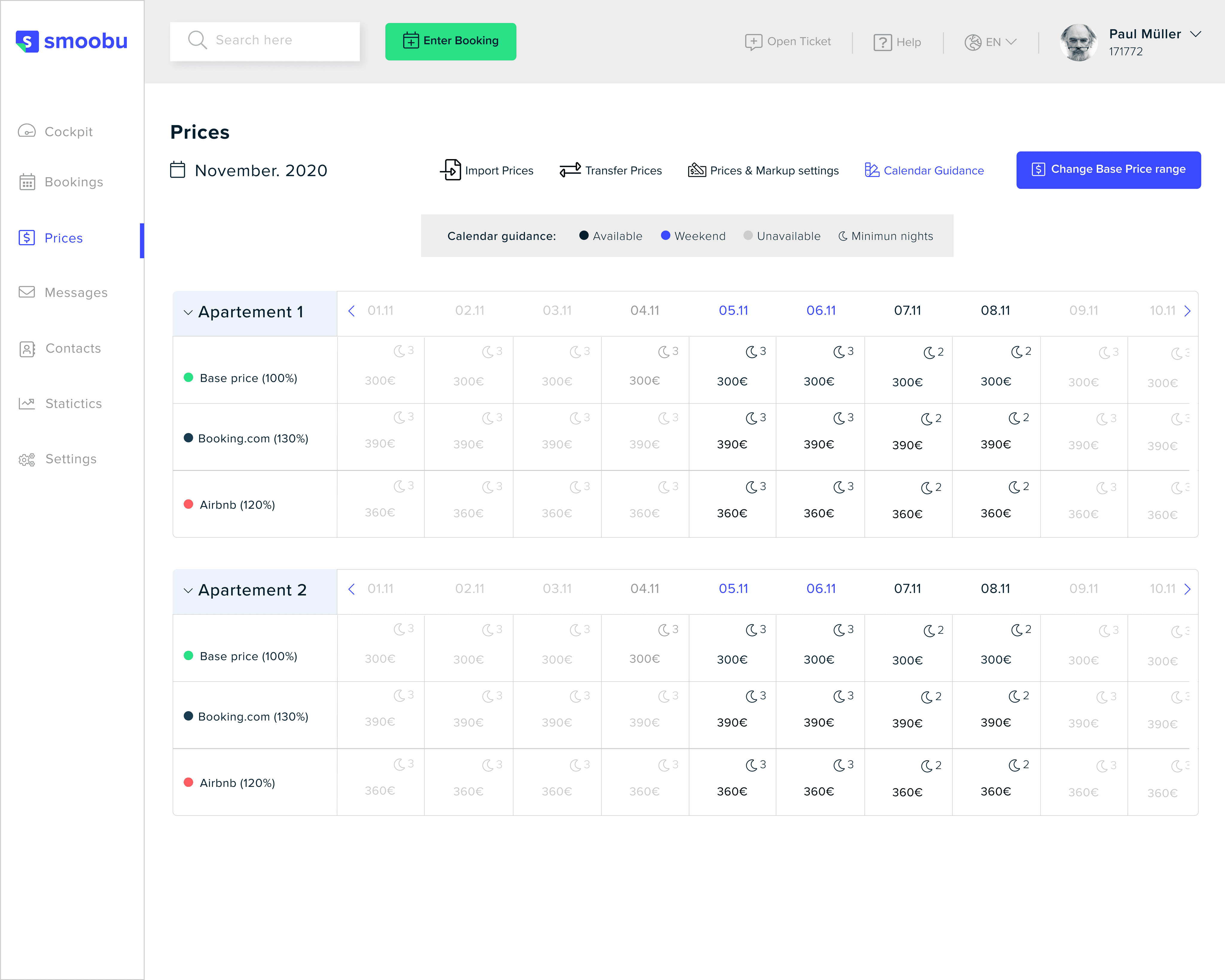
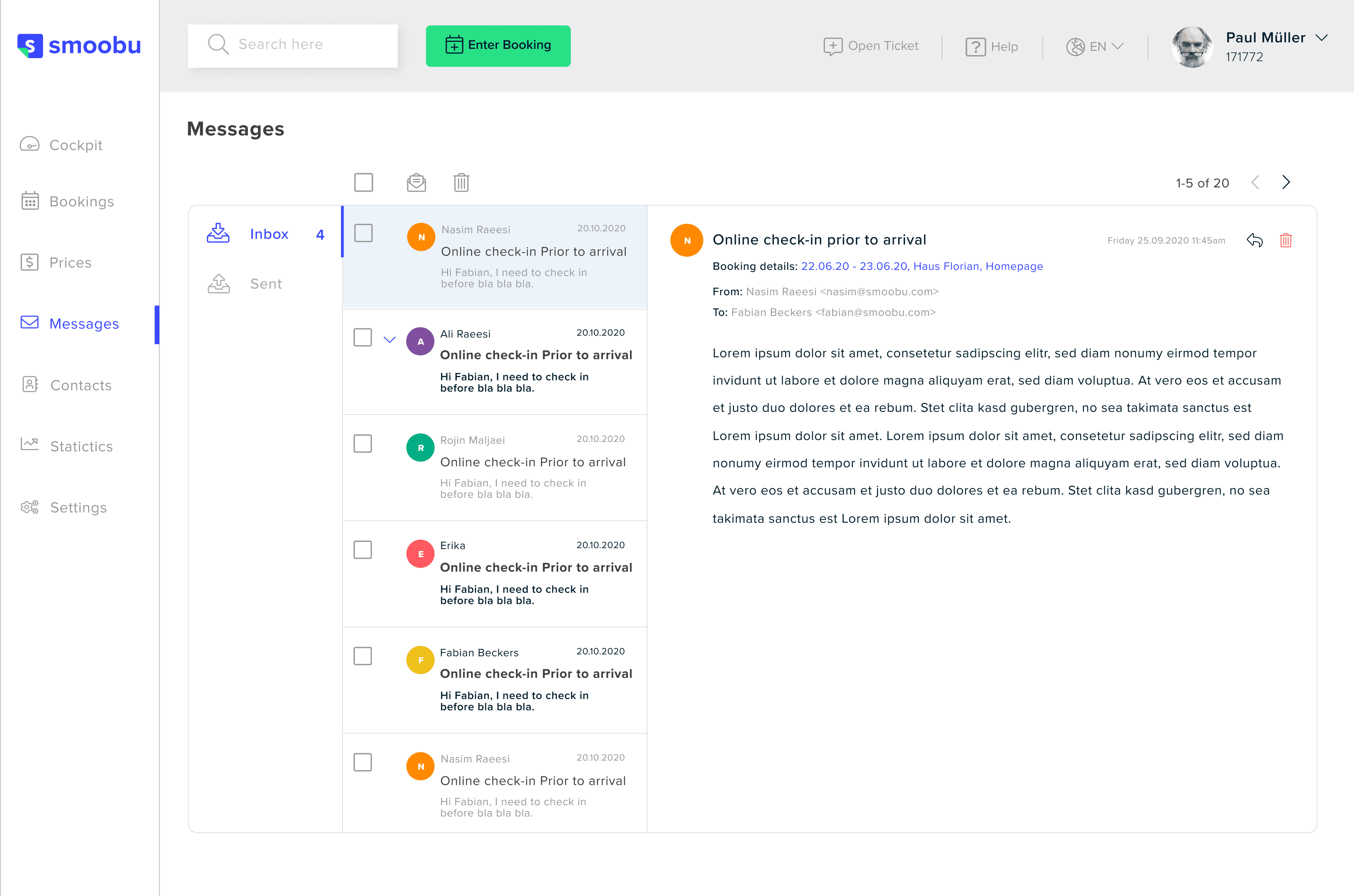
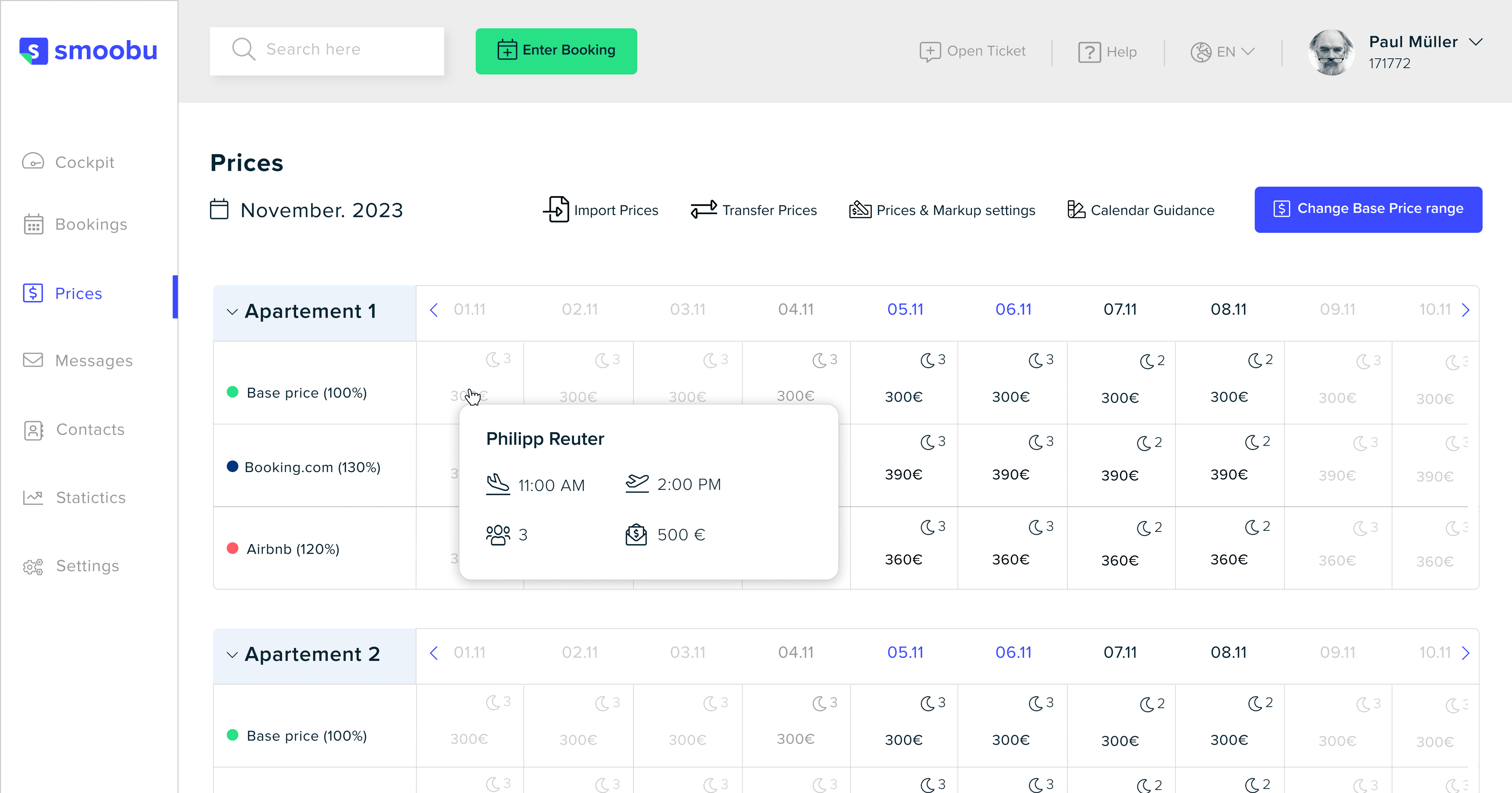
Smoobu is a vacation rental management portal that enables property owners/managers to manage a property on several booking platforms such as Airbnb, Booking.com&, etc. The platform helps the property owners/managers to manage different stuff at the same time such as centralized booking, communicating with their customers and customizing the property itself.
The resulting AI-powered scheduling app offers a seamless user experience, allowing individuals and businesses to effortlessly manage their schedules. Key features include:
Redesigning key pages and tools
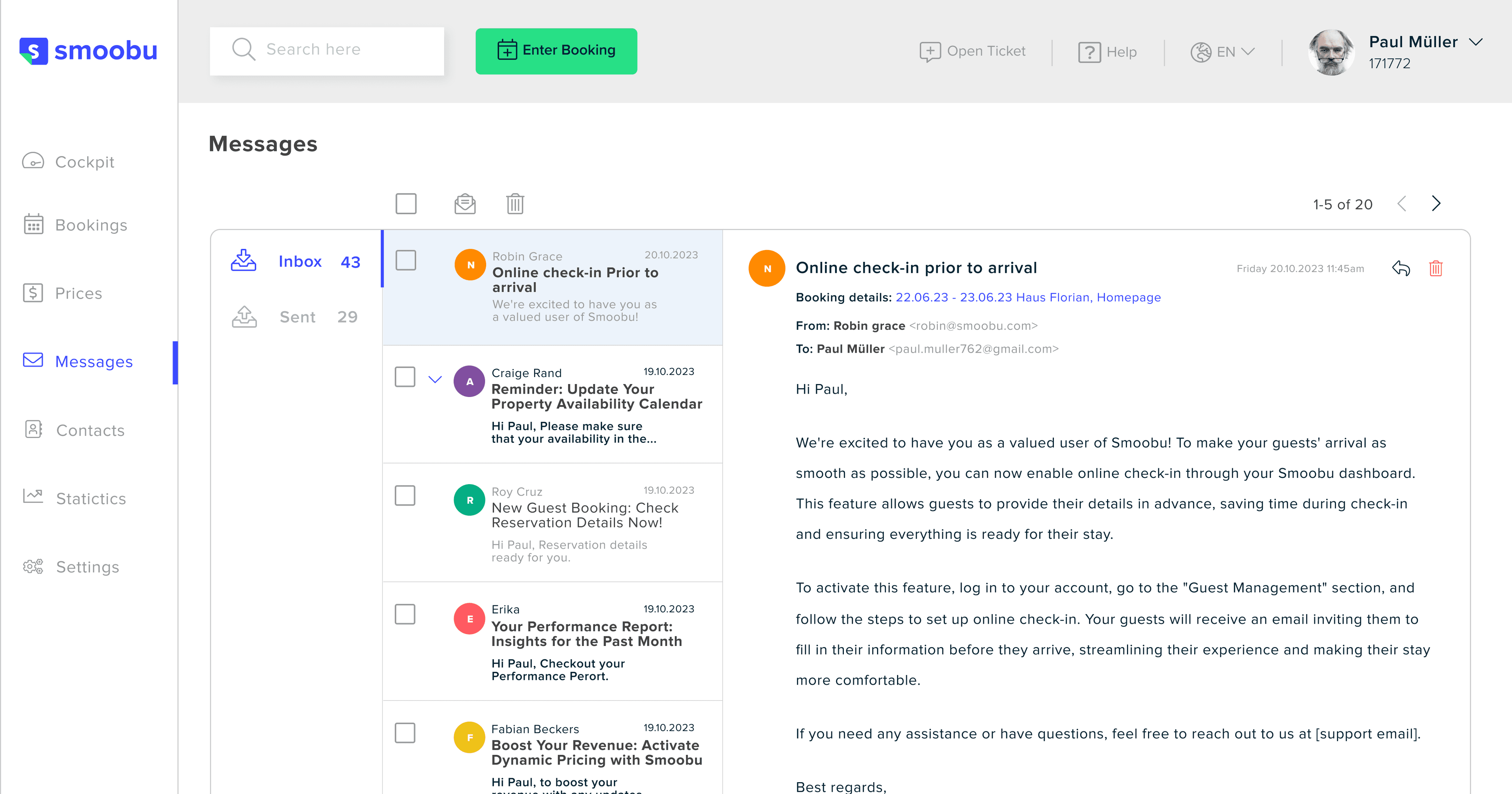
Redesigning some key pages such as centralised booking page to simplifying booking management system and customer messaging section
Adding an onboarding flow
New users are guided to a populated dashboard with essential data, reducing confusion and making the platform easier to navigate.
Creating design system
A consistent design system was implemented across the platform to ensure uniformity in components, layouts, and styles, improving user experience and platform cohesion.
The design changes led to measurable improvements in user experience:
Centralized Booking Efficiency
38% increase in task efficiency due to streamlined booking management and channels integration.
Customer service positive feedback
New user confusion decreased by 16%, with onboarding flow and channel integration before landing on the dashboard
Internal teams satisfaction
The introduction of a design library and brand guidelines improved cross-department collaboration (tech, marketing and product). Reduced inconsistencies in general.